Humdrum lab 5
This lab is about plotting data, and doing further analysis of the raw data extracted from Humdrum files.
There are several possibilities for plotting. We will focus on the last one in the lab, but here are other possibilities:
Load data into a spreadsheet
You can copy-and-paste data into a spreadsheet, either Microsoft Excel, Google Spreadsheets, or similar.
In MacOS, try the command:
humcat -s h://chorales | deg -at | serialize | ridx -H | egrep -v "=|r" | sortcount | pbcopy
pbcopy is used to copy data to the clipboard.
This will extract a count of scale-degrees in Bach chorales:
15628	5
14991	1
11710	3
10721	2
9435	4
7761	6
5742	7
4728	7-
1135	6+
1134	4+
556	3+
332	2-
326	1+
324	5+
50	3-
41	5-
32	2+
11	6-
7	1-
2	4-
Open up a spreadsheet program and paste the resulting data into the spreadsheet.
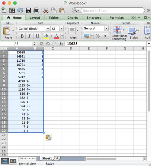
Notice that some of the cells in the B column are left justified while others are right justified. This is because Excel is autodetecting the format of each cell. It is right justifying the numbers, and left justifying the text.
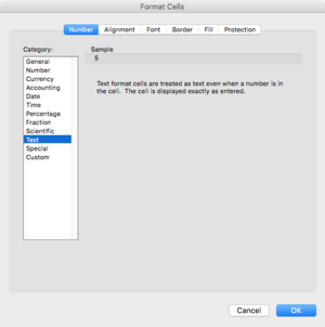
Make all of the B column identified as text by clicking on the "B" at the top of the column, then right-click and choose "Format Cell..." for the context menu that appears, and choose Text as the type for the column cells:
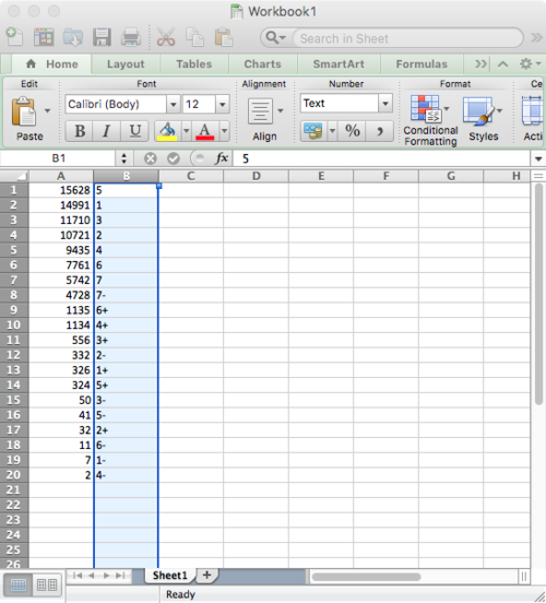
Now all cells in the B column are text:
Switch the order of the columns and then create a bar chart:
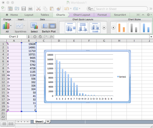
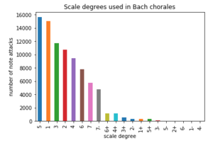
Compare the to barchart created further below with pandas/jupyter:
Plotting with Gnuplot
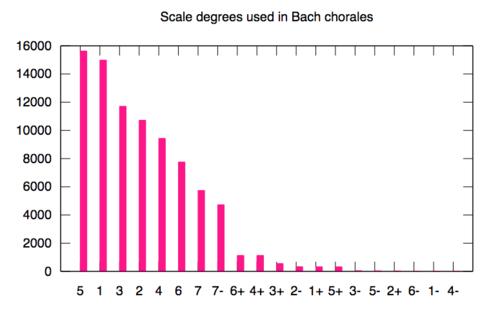
Gnuplot is a handy command-line plotting program. Here is an example of plotting the same data in gnuplot:
First save the data to a file:
humcat -s h://chorales | deg -at | serialize | ridx -H | egrep -v "=|r" | sortcount > data.txt
On MacOS, install gnuplot with Homebrew:
brew install gnuplot
Then create a file called plotbar with these contents:
 #!/usr/bin/env gnuplot

 set terminal svg size 800,500 enhanced font "Helvetica,20"
 set output "output.svg"

 set style data histogram
 set style fill solid
 set title "Scale degrees used in Bach chorales"

 unset key

 plot "data.txt" using 1:xtic(2) linecolor rgb "#ff0088"
Run the script with this command:
  chmod 0755 plotbar
  ./plotbar
This should create a file called output.svg that looks like this:
Jupyter/pandas/matplotlib
The rest of the lab examines how to load and plot similar data in a Jupyter notebook using pandas and matplotlib to display the barchart.
Check out the online version of the notebook here: http://nbviewer.jupyter.org/url/notebooks.humdrum.org/jupyter/craig/barplots/barplots.ipynb
Also, there is a download button on that page to download a local copy of the original jupyter notebook file.
To run jupyter on your computer, do these commands (may vary depending on os and other installation systems, but this worked well for me in MacOS):
brew install python3
This will take a while. Then install jupyterlab, which is the development version of the jupyter notebook web interface:
pip3 install jupyterlab
A nice, but optional thing to do is install the table-of-contents tab plugin:
    brew install nodejs
    jupyter-labextension install jupyterlab-toc
To start jupyterlab, type in the terminal:
jupyter-lab
If you want to use a specific browser because jupyter chose the wrong one:
   jupyter-lab --browser=chrome
   jupyter-lab --browser=firefox
   jupyter-lab --browser=safari
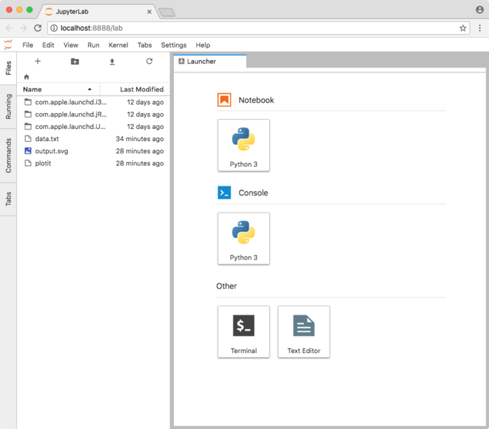
Here is the default window of jupyter-lab:
Useful tips for working in jupyter notebooks
- To run a program in a cell, click in the cell with a mouse and then type shift-return