Humdrum lab 5
This lab is about plotting data, and doing further analysis of the raw data extracted from Humdrum files.
There are several possibilities for plotting. We will focus on the last one in the lab, but here are other possibilities:
Load data into a spreadsheet
You can copy-and-paste data into a spreadsheet, either Microsoft Excel, Google Spreadsheets, or similar.
In MacOS, try the command:
humcat -s h://chorales | deg -at | serialize | ridx -H | egrep -v "=|r" | sortcount | pbcopy
pbcopy is used to copy data to the clipboard.
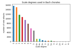
This will extract a count of scale-degrees in Bach chorales:
15628	5
14991	1
11710	3
10721	2
9435	4
7761	6
5742	7
4728	7-
1135	6+
1134	4+
556	3+
332	2-
326	1+
324	5+
50	3-
41	5-
32	2+
11	6-
7	1-
2	4-
Open up a spreadsheet program and paste the resulting data into the spreadsheet.
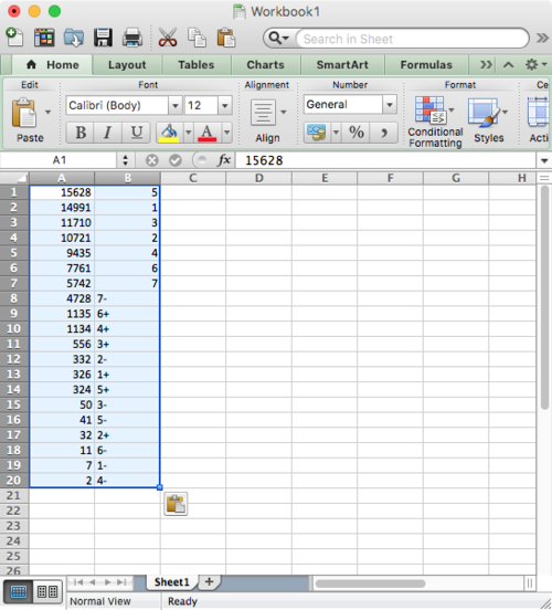
Notice that some of the cells in the B column are left justified while others are right justified. This is because Excel is autodetecting the format of each cell. It is right justifying the numbers, and left justifying the text.
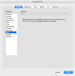
Make all of the B column identified as text by clicking on the "B" at the top of the column, then right-click and choose "Format Cell..." for the context menu that appears, and choose Text as the type for the column cells:
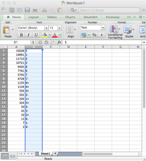
Now all cells in the B column are text:
Switch the order of the columns and then create a bar chart:
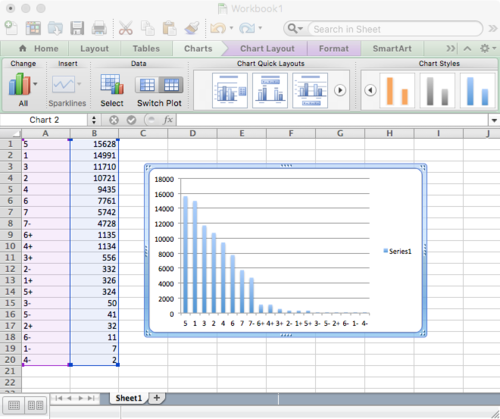
Compare the to barchart created further below with pandas/jupyter:
