Humdrum lab 6: Difference between revisions
| Line 137: | Line 137: | ||
[[File:gnuplot-barchart.png|center|500px]] | [[File:gnuplot-barchart.png|center|500px]] | ||
Gnuplot can be compiled with emscripten to be used directly inside of a webpage (without a server backend): | |||
* https://github.com/chhu/gnuplot-JS | |||
== Jupyter/pandas/matplotlib == | == Jupyter/pandas/matplotlib == | ||
Revision as of 00:03, 2 May 2018
This lab is about plotting data, and doing further analysis of the raw data extracted from Humdrum files.
There are several possibilities for plotting. We will focus on the last one in the lab, but here are other possibilities:
Load data into a spreadsheet
You can copy-and-paste data into a spreadsheet, either Microsoft Excel, Google Spreadsheets, or similar.
In MacOS, try the command:
humcat -s h://chorales | deg -at | serialize | ridx -H | egrep -v "=|r" | sortcount | pbcopy
pbcopy is used to copy data to the clipboard.
This will extract a count of scale-degrees in Bach chorales:
15628	5
14991	1
11710	3
10721	2
9435	4
7761	6
5742	7
4728	7-
1135	6+
1134	4+
556	3+
332	2-
326	1+
324	5+
50	3-
41	5-
32	2+
11	6-
7	1-
2	4-
Open up a spreadsheet program and paste the resulting data into the spreadsheet.
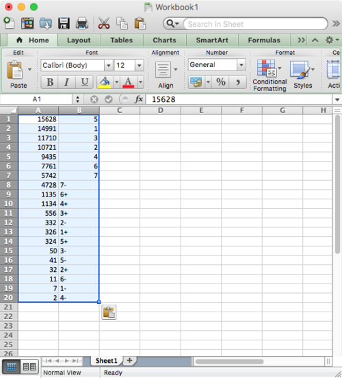
Notice that some of the cells in the B column are left justified while others are right justified. This is because Excel is autodetecting the format of each cell. It is right justifying the numbers, and left justifying the text.
Make all of the B column identified as text by clicking on the "B" at the top of the column, then right-click and choose "Format Cell..." for the context menu that appears, and choose Text as the type for the column cells:
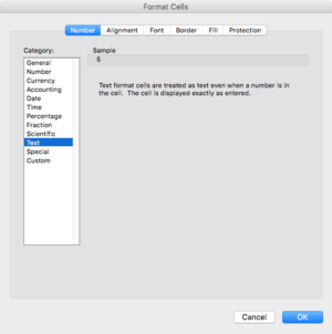
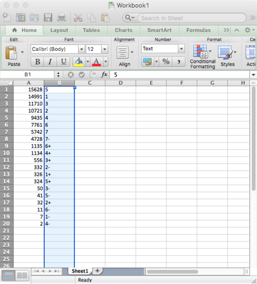
Now all cells in the B column are text:
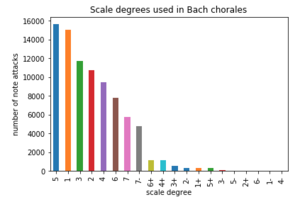
Switch the order of the columns and then create a bar chart:
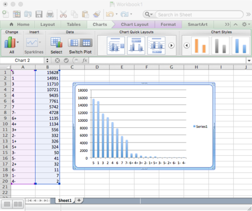
Compare the to barchart created further below with pandas/jupyter:
Datawrapper
Even easier than using a spreadsheet, try the datawrapper website to generate the same histogram:
This site "publishes" your plot and allows access to the underlying data.
Try clicking on the "Get the data" link on the chart. This will download a CSV version of the data (the input was in TSV format).
The above chart was created with this code copied from the datawrapper website:
  <iframe id="datawrapper-chart-vhkHL" src="//datawrapper.dwcdn.net/vhkHL/1/" scrolling="no"
     frameborder="0" allowtransparency="true" style="width: 0; min-width: 100% !important;" height="548">
  </iframe>
  <script type="text/javascript">
     if("undefined"==typeof window.datawrapper)window.datawrapper={};window.datawrapper["vhkHL"]={},window.datawrapper["vhkHL"].embedDeltas=
      {"100":648,"200":573,"300":573,"400":548,"500":548,"700":548,"800":548,"900":548,"1000":548},
     window.datawrapper["vhkHL"].iframe=document.getElementById("datawrapper-chart-vhkHL"),window.datawrapper["vhkHL"]
     .iframe.style.height=window.datawrapper["vhkHL"]
     .embedDeltas[Math.min(1e3,Math.max(100*Math.floor(window.datawrapper["vhkHL"].iframe.offsetWidth/100),100))]+
     "px",window.addEventListener("message",function(a){if("undefined"!=typeof a.data["datawrapper-height"])
     for(var b in a.data["datawrapper-height"])if("vhkHL"==b)window.datawrapper["vhkHL"]
     .iframe.style.height=a.data["datawrapper-height"][b]+"px"});</script>
Here is another variation:
Plotting with Gnuplot
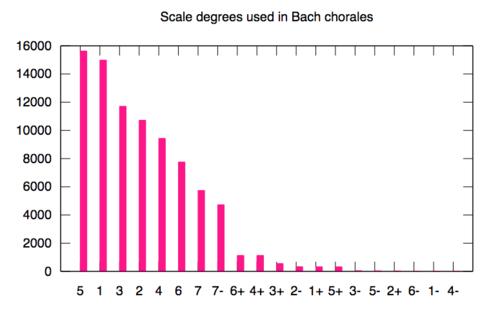
Gnuplot is a handy command-line plotting program. Here is an example of plotting the same data in gnuplot:
First save the data to a file:
humcat -s h://chorales | deg -at | serialize | ridx -H | egrep -v "=|r" | sortcount > data.txt
On MacOS, install gnuplot with Homebrew:
brew install gnuplot
Then create a file called plotbar with these contents:
 #!/usr/bin/env gnuplot

 set terminal svg size 800,500 enhanced font "Helvetica,20"
 set output "output.svg"

 set style data histogram
 set style fill solid
 set title "Scale degrees used in Bach chorales"

 unset key

 plot "data.txt" using 1:xtic(2) linecolor rgb "#ff0088"
Run the script with this command:
  chmod 0755 plotbar
  ./plotbar
This should create a file called output.svg that looks like this:
Gnuplot can be compiled with emscripten to be used directly inside of a webpage (without a server backend):
Jupyter/pandas/matplotlib
The rest of the lab examines how to load and plot similar data in a Jupyter notebook using pandas and matplotlib to display the barchart.
Check out the online version of the notebook here: http://nbviewer.jupyter.org/url/notebooks.humdrum.org/jupyter/craig/barplots/barplots.ipynb
Also, there is a download button on that page to download a local copy of the original jupyter notebook file.
To run jupyter on your computer, do these commands (may vary depending on os and other installation systems, but this worked well for me in MacOS):
brew install python3
Also some necessary modules for python:
    pip3 install matplotlib
    pip3 install pandas
This will take a while. Then install jupyterlab, which is the development version of the jupyter notebook web interface:
pip3 install jupyterlab
A nice, but optional thing to do is install the table-of-contents tab plugin:
    brew install nodejs
    jupyter-labextension install jupyterlab-toc
But I have had problems on most computers getting this to install without the installation process hanging...
To start jupyterlab, type in the terminal:
jupyter-lab
If you want to use a specific browser because jupyter chose the wrong one:
   jupyter-lab --browser=chrome
   jupyter-lab --browser=firefox
   jupyter-lab --browser=safari
Here is the default window of jupyter-lab:
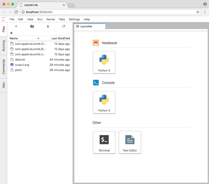
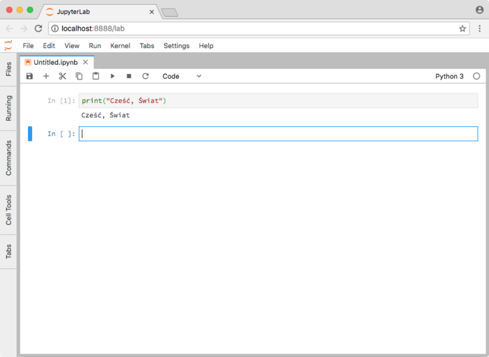
To create a new notebook, click on the "Python 3" icon in the "Notebook" section of the Launcher. You can load a notebook saved on the computer by using the file viewer on the left side of the window. Click on the "Files" tab on the far left to hide the file menu. Here is what the browser looks like after doing all of that and then typing a test command:
Now to go the webpage http://nbviewer.jupyter.org/url/notebooks.humdrum.org/jupyter/craig/barplots/barplots.ipynb
and download that notebook from the icon on the top right:

You will probably have to copy the notebook to the same directory in which you started jupyter-lab.
Before running the commands in the notebook, you may have to update your humdrum tools installation:
cd `which transpose | sed 's/humdrum-tools.*/humdrum-tools/'` && make update && make
Since I had to update the transpose tool to allow a stream of multiple input files at one time.
Useful tips for working in jupyter notebooks
- To run a program in a cell, click in the cell with a mouse and then type shift-return. This will evaluate the cell and print the results underneath.
- To add a new cell above the current cell. Press esc to exit from editing the cell. Then type a. A new cell should be added above the current one. Similarly b will create a new cell below the current one.
- Text can be added to the page by converting a cell to the markdown format, and then typing markdown data. To convert to markdown, click in the cell then press {keypress|esc}} to defocus on the text, and then type m. Then click in the cell again and add text. Then when finished, press shift-enter to convert to text.
- Here is a summary of Markdown syntax for adding text commentary to your notebooks: https://github.com/adam-p/markdown-here/wiki/Markdown-Cheatsheet. Jupyter notebook markdown is somewhat more constrained than Github flavor of markdown.
- 15 Nov 2017 blog about Jupyterlab: JupyterLab first impressions
- Video presentation on Jupyterlab: https://www.youtube.com/watch?v=w7jq4XgwLJQ
- Jupyterlab tutorial docs: https://media.readthedocs.org/pdf/jlab/debug-rtd/jlab.pdf
- Jupyterlab online docs: https://jupyterlab.readthedocs.io/en/stable/
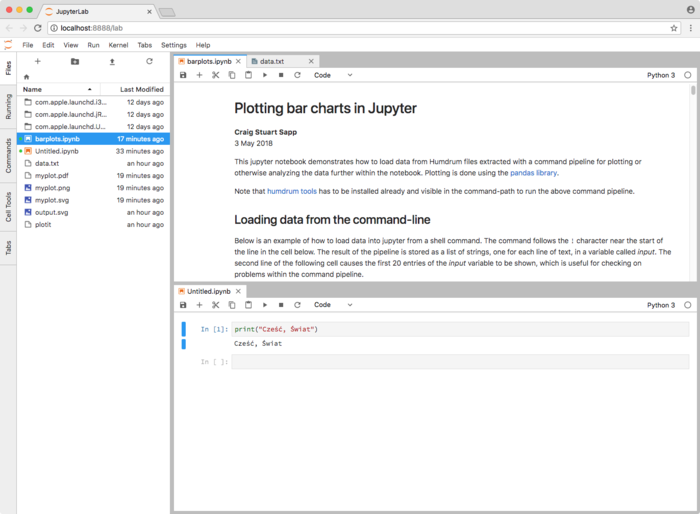
Jupyterlab also allows multiple sets of tabbed workspaces, which is useful:
Further reading for jupyterlabs and pandas
R markdown notebooks
The R langauge is another useful language for statistical analysis and plotting of data. This is not covered in the lab, but checkout the website: https://rmarkdown.rstudio.com/r_notebooks.html
Other data plotting systems
- Bokeh https://bokeh.pydata.org This is a python visualization library
- Seaborn tps://seaborn.pydata.org Another python visualization library
For creating your own interactive plots on the web in Javascript:
- D3 https://d3js.org
- Example barchart using D3: https://bl.ocks.org/mbostock/3885304